Short review of the Arsenal website
I'm not a fan of football, and probably the last match I've seen was years ago. Nevertheless, I like websites that are beautifully designed and that keep large groups of people united around a common goal, while showing how humane every moment, connection and emotion could be.
Here's a simple screenshot from the main page:

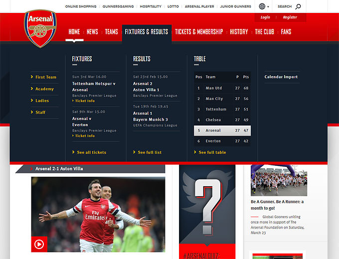
The font in the top story is white on a black background, which again contributes to great visibility and readability. Better yet, the distance between the type in the navigation and the type on this story is divided by complementing red and black, which draws additional interest.
Now we hover over the category “Fixtures and results”:

Here we see two things: the way Arsenal prominently highlights the rank of the team while graying out other teams (1) and the changed position of the red line which on the one hand serves as a divider from the main content and on another continues the already consistent line of branding Arsenal follows (2).
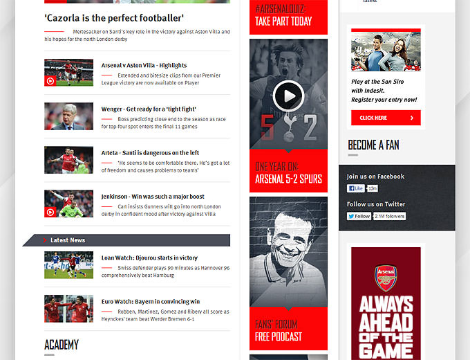
When I scroll a bit, here's what I see.

Normally I don't like to see contiguous group of objects that cuts the site in half, not only because it detracts from the message of the content, but because it hinders reading all the way down. Here we can see one way to balance brand and content. Notice how the triangles follow a straight line that leads the eye from one box to the next, contributing to traction, acceleration and dynamism. Although the content takes a larger area, the brand continues to connote its existence. Notice how the content is organized and how clear the invisible lines between consecutive items are. This speaks for a great attention to detail in a broader context.

The rest of the page is again very well organized with photos of happy managers and players. The balance that we saw in the main page is preserved completely in this page, albeit in a different form—something which I rarely saw so well executed.
The Arsenal website can also be a good example for emotional web design. Photos are chosen to be striking, to be remembered, to show action and the emotion arising from it, to provoke emotion in the visitor.
Quality graphics never comes free and this site isn't an exception. It weights around 1.4-1.5MB and can make around 100 HTTP requests—both depending on the current page—so that an initial full load takes around 30seconds. Nothing is ever perfect, but it seems that sometimes this word gets a new meaning.